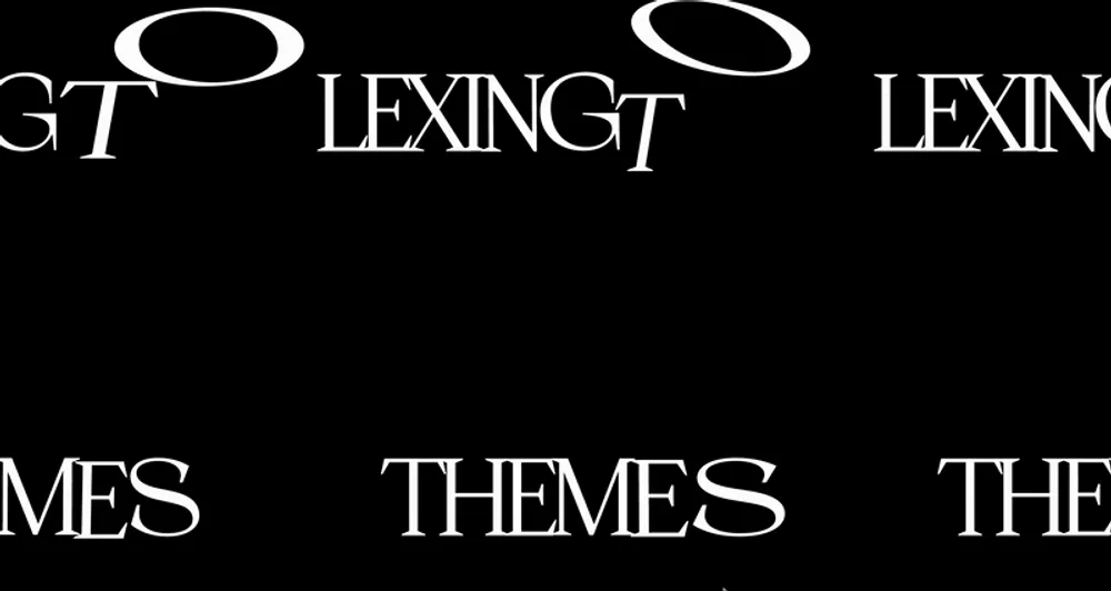
Five Google Fonts pairings for 2024
These fonts offer a modern look and work well together, making them a great choice for your next project.
A Brief Introduction
What is Google Fonts?
Google Fonts is a free, open-source project offering a diverse array of fonts for designers and developers. It aims to provide fonts for a range of uses, including web and print design as well as digital media. Explore Google Fonts at Google Fonts.
Serif Fonts — Serif fonts are traditional and formal, often used in books and newspapers. They have a smaller x-height and a refined, upright look. Popular serif fonts include Times New Roman, Garamond, and Baskerville.
Sans-Serif Fonts — Sans-serif fonts have a modern, casual look. Often seen on websites and digital interfaces, they feature a larger x-height and more rounded shapes. Common sans-serif fonts include Arial, Helvetica, and Inter.
Display Fonts — Display fonts are bold and attention-grabbing, often used in headlines and titles. With strong visual appeal, they’re designed to stand out at various sizes. Examples include Helvetica Neue, Futura, and Avenir.
Monospace Fonts — Monospaced fonts have a fixed width for each character, commonly used in coding and technical documents. Popular examples are Courier New, Consolas, and Monaco.
Script Fonts — Script fonts have a flowing, calligraphic style, often used for decorative purposes. Notable examples are Brush Script, Calligrapher, and Pacifico.
// Example: Function to calculate the area of a rectangle
function calculateRectangleArea(length, width) {
    if (length <= 0 || width <= 0) {
        throw new Error('Length and width must be positive numbers.');
    }
    return length * width;
}

// Usage
try {
    const area = calculateRectangleArea(5, 10);
    console.log(`The area of the rectangle is: ${area} square units.`);
} catch (error) {
    console.error(error.message);
}
Key Considerations When Choosing Fonts
When selecting fonts for your site, consider your content’s purpose and audience. Here are some guidelines:
- Readability: Ensure fonts are easy to read and clear at different sizes. Avoid sizes that are too small or too large, as they can distract from your content.
- Contrast: Make sure there’s sufficient contrast between text and background to improve readability. This can be achieved with dark and light colors.
- Alignment: Decide on a consistent alignment, whether left, right, or centered, to maintain a cohesive design.
- Hierarchy: Use different font sizes and weights to create a visual hierarchy, making your content easier to follow.
- Accessibility: Choose fonts that are legible for all users, including those with disabilities. High contrast and readability are crucial.
- Branding: Align font choices with the brand’s personality and style for consistency.
Font Pairing Recommendations
Pairing #1 — Bricolage Grotesque & Inter
Bricolage Grotesque is a unique blend of historical and technical influences, derived from Mayenne Sans by Jeremy Landes. Inter, a variable font family by Rasmus, was crafted for optimal screen readability with a high x-height, enhancing mixed-case and lowercase legibility.
Get Inter here and Bricolage Grotesque on Google Fonts.
Pairing #2 — Instrument & Instrument Sans
Instrument Serif, a condensed display font, was designed for larger sizes with a modern, classic serif feel. Instrument Sans, a variable font, offers a refined sans-serif aesthetic with playful details inspired by neo-grotesques.
Find them on Google Fonts: Instrument Serif and Instrument Sans.
Pairing #3 — Syne & Urbanist
Syne was created for Synesthésie, an Art Center in Saint-Denis, and is known for its eclectic style. Urbanist, designed by Corey Hu, is a low-contrast geometric sans-serif, perfect for versatility in digital and print media.
Get Syne here and Urbanist on Google Fonts.
Pairing #4 — Spline Sans & Spline Mono
Spline Sans, ideal for UI and text-heavy interfaces, combines classic grotesque traits with space efficiency. Spline Sans Mono, a monospaced version, also features “thorn” details that become prominent in larger sizes.
Get them here: Spline Sans and Spline Mono.
Pairing #5 — Prata & Open Sans
Prata, a Didone typeface, has sharp contrasts and teardrop shapes, perfect for high-impact display. Open Sans, designed by Steve Matteson, is known for its wide character set and readability across formats.
These Google Fonts pairings are some of the top choices from Colors & Fonts. Hope this inspires you for your next design project!
Join our newsletter
Stay up to date with our latest news and updates.
Achieving peak website performance: a 2024 guide
Uncover key strategies for maximizing site performance, from load speed improvements to enhancing overall user experience.
Optimizing your website for speed and user engagement in 2024
Discover effective techniques to reduce load times, enhance user interactions, and ensure your site delivers a fast, engaging experience.
Nineteen of the best sind to hunt for free fonts
Your essential guide to the 19 best sources for high-quality free and open-source fonts.
Dive into darkness with 5 striking dark color palettes for your next website
Explore bold and dramatic tones to elevate your design aesthetic.
